Illustration • Art Direction
Tri.Club
Tri.Club explores and experiments with new food concepts by fusing Taiwanese food culture with western-known recipes. Starting with sandwiches, a familiar dish no matter where you're from, with the potential to be creative on the fillings.
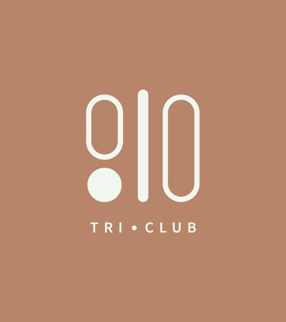
There are multiple meanings behind Tri.Club logo: Three founders, the traditional Chinese character “Three三” horizontally, and a stack of sandwiches. The natural color palette and hand-painted illustrations represent the balance between healthy and innovative dishes and deliver Tri.Club’s passion for Taiwanese food and culture with everyone.
Follow Tri.Club and find out where they are going next!